Monday 31 October 2016

Words Associated With Acoustic - Wordle -


This was my first attempt at a wordle, I used all the words I could think off that are associated with acoustic.

How My Contents Page Research Has Influenced My Planning

The headers used incorporate simple colors and fonts which I fell give a really clean and prestigious look. I like how the contents page writing is aligned to the right hand side, this breaks conventions which is very rebellious and appeals to a young TA. The studio shots have given me ideas for poses for my model in my magazine. I will need to uses both formal and informal language for my magazine as I need it to be sensible yet appealing for my TA. I love the images of guitars this works really well as a convention. I will use white backgrounds as I feel it gives a really clean and good look. On all contents pages that has men playing guitars a majority of the time they are wearing shirts with the top button undone, my star will have his does up to break this relaxed convention.

How My Front Cover Research Has Influenced My Planning

My first analysis was of a rock magazine, which was a very rebellious magazine. It used dark tones that I feel worked really well for the dark type of music. If any of my magazines is of a dark nature the use of dark tones will work excellently. It uses multiple profanities which I feel works perfectly for a magazine that would be targeted towards young people. The use of explosions in it added to the male orientation of the magazine. My second analysis appealed to me in different ways. I really like how freely the artists names were displayed around the front cover this gives a feeling of how young the magazine is which appeals to the young target audience. The colours used were really appealing, they were very vibrant and stood out to me however the poses they were in did not appeal to me very much as I found them to be quite intimidating. The fact that it uses men and women shows diversity, which really appeals to me and will appeal to men and women of the young age. My third analysis was very simple however I feel simplicity is the highest form of sophistication. It uses plain colours, which I feel is great as it will not be hard on the eyes. The use of banners give a professional look, which is what I, will want to use too. It uses a 3 colour scheme, which keeps it simple yet prestigious.

Wednesday 19 October 2016

Research: Masthead Font - Audience Research -


I created this sheet and asked close family and friends which name they preferred, I then went back to my computer template and filled in the results electronically. A font called The Unknown is what I will use.

Confirmed Masthead

The masthead I have chosen to go with is Apex. Out of the three I came up with, this was a personal favourite of mine. After I conducted my audience research to find out which name they preferred most it became apparent quickly as to which name they wanted, Apex.

My next task is to conduct TA research to find out which font style and look suits the branding the best. I've had a look on 1001 freefonts and think i will go for something like this however, i still want to spend more time on this.


Masthead - Audience research -


I created this sheet and asked close family and friends which name they preferred, I then went back to my computer template and filled in the results electronically. Apex will be the name of my acoustic pop music magazine.

Planning: Possible Mastheads

Possible names for my magazine masthead are:

Abstract. - I feel this name will represent my magazine well as it will hint at the fact that everything within the magazine has reached a deeper meaning which further implies there is more to it and it is worth reading. The definition of abstract is "existing in thought or as an idea but not having a physical or concrete existence." I feel this is a great word to represent my magazine as it allows the reader to understand that my magazine isn't like a normal issue of a acoustic magazine that they would expect to see, hence the term abstract.

Apex. - This term would connote that my magazine is at its pinnacle which would entice the reader to begin looking into the magazine The word Apex also derives from the term Apex Predator which is a predator at the top of the food chain which implies that out of all the magazines created around my genre my magazine is at the top.

Power. - This term in its self would represent the true nature and force behind my magazine. To have power is to have influence and this is what I want my magazine to have on the reader, I aim to influence.

Tuesday 18 October 2016

Research: Analysis Of Contents Page - 2 -


Presentation1 from SamMoverley301

How this research influenced my creativity

1] I will need both formal and informal language - I want  it to have the sophistication of acoustic but also include colloquialisms etc to appeal to a younger TA.
2] I like the images of guitars, i think this works well as a convention
3] I like the white clean look of white backgrounds

Research: Analysis Of Contents Page - 1 -

Powered by emaze
1] The header - I like the simplicity [ the highest form of sophistication!]

2] I like the left alignment - this manipulates conventions

3] Studio shots are in my planning but this has given me an idea for a pose.

Monday 17 October 2016

Research: Analysis of a DPS - 1 -


How this Research has influenced my planning and creativity.

1] I love the 3 colour scheme
2] I really like how dark it is.
3] The graphology and what it represents is amazing.

Planning: Initial Ideas And Creativity Post

The genre I have chose is Acoustic I have experience as when I was younger I used to play acoustic guitar so I have personal experience with the genre, this means I also have a guitar at home to bring in for my model to use in the photo shoot. My star will be Connor MacMillan, he will be wearing a shirt and jeans which is very casual which will adhere to the traditional convention of a acoustic magazine. He will be stood with a acoustic guitar which will obviously link to the genre. the photos will be taken in a studio setting to show how prestigious the magazine is. The photos will be taken on the18th of October 2016 at my sixth form, this is because my sixth form are having an open evening, in this evening they will be holding a photo shoot for us to get photos for our magazines.

My DPS will be about Connor and his come up (his rise to fame) it will display all the key points in his life that have had an effect on the way he is as a person and the effect it has had on his music. Richard Dyre said that "A star is an image, not a real person, that is constructed" The way Connor will be portrayed will be constructed by me, his back story will also be constructed by me which links to Richards Dyres representation theory. My magazine will appeal to people of the ages between 16 and 22, the magazine will have to be youthful yet refined to show the true nature of acoustic without "boring" my TA. My star is 16 years old which will appeal to the younger years as there may be things in Connors life that they can relate to.

The colours used will be very light to portray a very reputable magazine that is professional and distinguished I will use a sans serif font which will also exhibit how renowned the magazine is. The light colours will connote to god to show purity and will also link to my stars (Connor) religious beliefs. it will also link to one of Connors most popular songs "Dear God" in which he tells his fans the things he discusses with god over night.

Some of the conventions frequently used in acoustic magazines that i will follow are: Online subscription, Masthead 1/5th of the page usually in red, blue or green.


Sunday 16 October 2016

Planning: Photo Shoot Plan

The pictures that i will be taking will be used for my Front Cover, Contents and DPS.
The photo shoot will take place at Brigg sixth form on the 18th of october 2016 at 4:00pm
The name of my model is Connor MacMillan and he will be wearing a red checked shirt, black jeans and plain black shoes, he will also be holding a red and black guitar. I will be doing a range of shots including Low angle, Mid shot and long shot all in different poses with the guitar next to and in front of my model i will also take shots of my model sat down on a stool. and in my shots i will try to get my model centre frame. My model will be wearing red which is a conventional colour of an acoustic magazine. I intent for my TA to read the pictures of my model as a man who as come from a struggle but still managed to work his way up to becoming an Apex Predator in the game aka the acoustic genre.

Friday 7 October 2016

Research: Links, Synergy + Brand Identity.


Metal Hammer uses similar fonts throughout the front cover and contents page. The same edgy writing creates a brand identity for the audience as they will recognise the edgy look that is presented. The front cover also uses a lot of black however the contents pages uses a lot of red and the front cover does not. 

Monday 3 October 2016

Research: Acoustic - Issue 123 October 2016 - Analysis 3 -

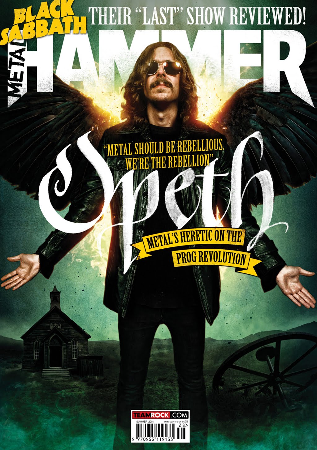
Personally I feel that the most outstanding feature is passenger himself as is he is the very centre of the magazine and takes up the full front cover.

The 
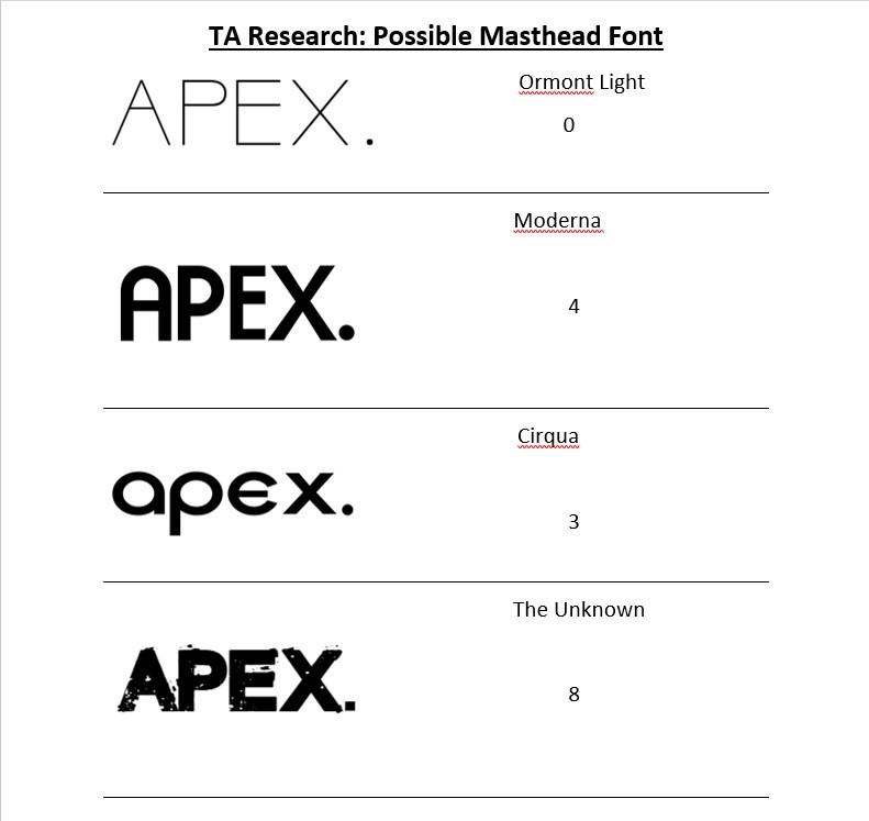
masthead is located at the top of the page and it takes up a small proportion of the page, the masthead is in a plain white colour, I feel this is a good colour to have as it stands out from the rest of the page yet it is easy on the eyes. The masthead is in a Sans Serif font which hints at the simplicity of the magazine. However, I feel that this is a very good look for the magazine as I believe in what Leonardo De Vinci said "Simplicity is the ultimate form of sophistication."


There are 4 cover stories on the front cover, two of the cover stories are written in sans and the other two are written in Sans Serif which I feel hints at the magazines diversity, this is also implied through the fonts different sizes however the change in sizes are not drastic. The fonts are very plain and simple yet very elegant and refined which i feel represents the genre perfectly.


The magazines target market is male and women of a much older and mature age, even though that magazine uses a lone male on the front cover there is evidence of female interviews given within the cover stories. There is a red banner at the very top that contains a cover story which follows a traditional convention of a magazine. There is also 3 banners in front of passenger, I feel this takes away some of the prestige of the magazine and I will not do this on my magazine. The two cover stories that are written in serif are given subheadings that are written within red banners. The main colours used are white and red. the white masthead is the same on most magazines with a few acceptations and the use of red adds a sophisticated look to the magazine which fits perfectly as some of the connotations of the colour red are: compassion, beauty, success, desire and ambition. the repeated use of a white masthead gives the magazine a recognisable house style that the audience can clearly see in any shop.

The magazine makes me want to buy it as I love the simplicity of the front cover, it really grabs my attention. The front cover includes a barcode, the company logo as they are the ones who published the magazine. The image does relate to the masthead as passenger has an acoustic guitar on his back which shows the reader why he is on the magazine. Passenger is engaged in eye contact with the camera which gives a special relationship between the reader and him. Passenger is stood up right with his arms slightly in front of him I can see this as the picture was taken as a long shot. the chest of \passenger is covered by text but this is it. the rest of the text is either around him or behind him which shows his importance. The picture is sharp and clear and in color in addition the background is in focus. Also, the background is not cluttered. This photo was taken in a studio setting which adds the the professional look. The guitar on his back signifies his purpose on the magazine front cover and also gives the audience a clue as to what he is being featured for.

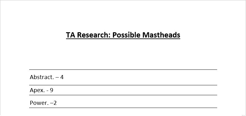
How this research has influenced my planning and creativity.
1] Simplicity is the ultimate form of sophistication.
2] Plain colors, I wont use ones that are hard on the eyes.
3] Use banners to give a professional look.
4] Use a 3 color scheme which keeps it simple yet prestigious.