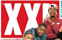

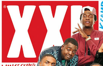
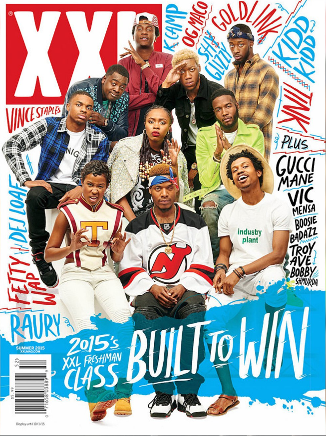
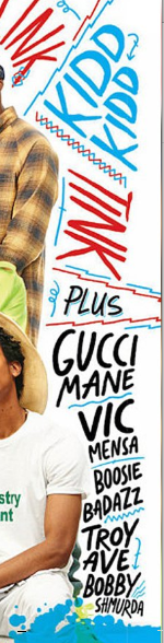
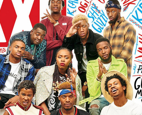
The most outstanding feature of the magazine is the big group of artists gathered in the middle of the cover. The masthead is at the top left of the magazine, XXL adheres to conventions by repeating this by doing this they are also creating a brand identity.The masthead only takes up a small proportion of the magazine and part of it has been placed behind the group of young artists. The masthead is a red box with the letters 'XXL' written in white, this could suggest a theme of passion as the company XXl are passionate about the style of music they make. The masthead is written in sans serif which is repeated throughout all the magazines. However, all the other text that is displayed on the front cover ( the artists names and feature story) are written in serif, this gives a more relaxed feel to the magazine as this magazine would be targeting the younger generation. There is only one feature story and there are no cover story's by doing this XXl are challenging a conventions but upon doing so they are showing how rebellious rap music can be as traditionally rap music was used to give black people a voice when they were oppressed.

The font style and size varies throughout the front cover to show the diversity of the multiple rappers/artists they have incorporated into their front cover. I feel the font does represent the genre of rap music as I feel it gives people freedom to say what they want in any way they want, the font comes across as hand written which gives a sense of freedom.

The magazine is intended to appeal to male and females that are aged between 16 - 21, I know this as the front cover uses male and female rappers and has labelled them as the 'Freshman class of 2015' which shows them as a young group of individuals as the freshman is given to people who are in their first year of high school. The front cover uses a blue splatter shape instead of a banner this also links to the freedom that the genre of rap portrays, this is a convention that is used to meet a younger target audience this makes it more appealing to the younger generations as it makes the magazine look more rebellious. The banners are slightly transparent which allows me to still see the the main image through it. The main colours are blue and red. However the colours of the masthead are red and white which is repeated throughout their magazines which creates a recognisable brand identity.
The magazine makes me feel compelled to buy it as the amount of artists and the front used on the names really appealed to me. The magazine includes a barcode with an issues, the price and a web address for the buyer to follow.


All of the artists are looking at the camera which adheres to the convention. The group are all sat together arranged as if in a class photo which links to the feature story 'Class of 2015'.
The photo is a long shot that I cropped. Only a small section of the image is covered by the writing but it is slightly transparent which allows me to see the image behind the text. the picture is very sharp and clear, professionally taken. The background is a plain white background that is in focus. The image is also coloured. All the models are wearing clothes that are associated with young rappers which links to the young target audience as they try to dress like the latest rappers as they feel they are very hip. The photo was taken in a studio which is a professional setting.

Perkins says that 'stereotypes are not simple' when people see a group of ethnic minorities they look for things such as turned baseball caps and bandanas which this image adheres to. However, they are also wearing shirts and gold chains and expensive shoes which can symbolise RnB however, the check shirts are not what people would automatically assume for this group to be wearing.
How this Research has influenced my planning and creativity.
1] I really like how freely the names of the artists are displayed.
2] The colours used are very appealing to me.
3] The blue colour splat is something I could use.
4] I didn't like the poses they are in.
5] the fact it uses men and women appeals to me as it shows the diversity.


